

A law firm website has to do more than look professional. It has to make a potential client feel confident enough to take the next step. That is a much harder job than simply listing services or publishing attorney bios. Most legal prospects arrive with stress, urgency, and unanswered questions. They want to know whether the firm handles their problem, whether the lawyers seem credible, and whether contacting the office will feel straightforward or frustrating.
That is why trust sits at the center of effective law firm website design. A legal website should reduce doubt, not add to it. Clear service pages, strong attorney profiles, fast performance, and a simple path to contact all shape whether a visitor stays or leaves. The American Bar Association’s guidance on designing a law firm website reflects the same reality: a legal website has to communicate usefulness, professionalism, and credibility from the start.
Key takeaways
- Law firm websites perform best when they reduce uncertainty quickly.
- Clear practice area pages, attorney bios, and visible contact options matter more than flashy visuals.
- Mobile usability and site speed affect trust before a prospect ever speaks to the firm.
- Strong legal websites guide visitors toward a single obvious next step rather than scattering their attention.
- Better structure and clearer messaging usually improve lead quality as much as design polish does.
Why is trust the real design goal?
People do not hire lawyers the way they buy ordinary services. They usually start searching when something important is already at stake. It may be a family dispute, a criminal charge, a real estate conflict, a personal injury claim, or a business issue that suddenly feels urgent. In each case, the website becomes an early filter. Before the prospect ever calls, the site is already answering one silent question: Does this firm feel trustworthy?
That answer is shaped by details. Does the site clearly explain what the firm does? Are the attorneys visible and credible? Is the copy specific or vague? Is the information current? Is it easy to contact someone without friction? Legal prospects do not always consciously analyze these details, but they react to them quickly.
This is why trust should shape the full structure of the site, not just the design layer. Headlines, navigation, page order, attorney bios, testimonials, contact forms, and even button wording all contribute to whether the experience feels reassuring or uncertain.
What legal prospects want to know right away?
Most visitors want the same core questions answered almost immediately. Do you handle my kind of case? Where are you located? Who will I be speaking with? What should I do next? Can I call now? Do you offer consultations? How fast will someone respond?
A strong law firm website answers those questions early. It does not make the visitor dig through broad branding language just to understand the basics. Practice areas should be easy to find. Office location and contact details should be visible. The attorney team should feel real, not hidden behind generic marketing copy. A prospect should be able to understand within seconds whether the firm is relevant to their situation.
This is especially important for transactional search intent. The visitor is not browsing casually. They are trying to evaluate fit and decide whether to act. Every extra layer of confusion weakens the chances of conversion.
Clarity is more persuasive than cleverness
Law firm websites often weaken themselves by trying too hard to sound impressive. The copy talks about dedication, excellence, results, or advocacy without helping the prospect understand anything concrete. That type of language may sound polished, but it does very little to reduce uncertainty.
Clear writing performs better because it reduces the work for the visitor. A family law page should explain what family law matters the firm handles. A criminal defense page should clearly outline the types of charges or stages of a case it covers. A real estate law page should make it clear whether the firm handles residential closings, commercial matters, disputes, or title issues.
The goal is not to sound dramatic. It is to sound dependable, informed, and easy to understand. In legal marketing, clarity does not make a firm look less sophisticated. It makes the firm look more confident.
Speed and mobile usability shape credibility
A slow website does more than frustrate people. It makes the firm look less organized. If a page drags, a form freezes, or the phone number is hard to tap, confidence drops quickly. Google’s research on mobile page speed and user behavior shows how strongly performance affects whether visitors continue or abandon a site. For law firms, that matters even more because many prospects are making decisions under pressure.
Mobile experience is especially important. Legal searches often happen from a phone, sometimes in stressful or time-sensitive situations. If the site still feels like a desktop layout compressed onto a smaller screen, the experience immediately works against the firm. Menus need to be simple, buttons easy to tap, forms short, and calls to action obvious. The same conversion principle that drives a site designed to turn visitors into clients becomes even more important when the visitor is seeking legal help rather than general information.

The pages that matter most
Not every page on a law firm website carries the same weight. Some pages do most of the trust-building and conversion work because they answer the exact questions prospects use to evaluate fit.
| Page type | What visitors expect | Why it matters |
| Homepage | Practice focus, location, trust signals, next step | Sets direction and first impression immediately |
| Practice area pages | Specific help by legal issue | Matches intent and reduces confusion |
| Attorney bio pages | Experience, credentials, background, approach | Humanizes the firm and builds credibility |
| Reviews or trust pages | Social proof and reassurance | Helps prospects feel safer reaching out |
| Contact or consultation page | Clear, easy intake path | Turns interest into an inquiry |
A site can look modern and still underperform if these pages are thin, generic, or hard to find. Good legal websites treat them as core assets, not secondary pages.
Intake should feel easy, not intimidating
Prospective clients often hesitate at the point of contact. They want to know what happens when they call or submit a form. Will they speak to a lawyer, an intake specialist, or a receptionist? Is the consultation free? How much detail should they share? When should they expect a response?
A good website reduces that hesitation. It does not rely on a vague “Contact Us” label and hope for the best. It explains what the next step looks like. It uses a short, focused form. It keeps the phone number visible. It sets clear expectations where needed.
This matters because legal inquiries are inherently sensitive. If the intake path feels confusing or too demanding, prospects delay action. If the next step feels simple and manageable, they are much more likely to move forward.
Proof matters more than polish
Visual polish matters, but not as much as many firms assume. Once a visitor stays on the site, they start looking for evidence. They want to know who the attorneys are, what experience they bring, what types of matters they handle, and whether the firm feels current and credible.
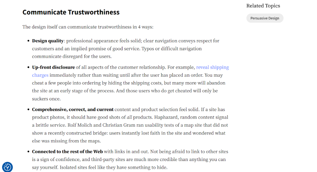
That is why strong law firm websites usually include detailed attorney bios, clear office information, focused practice area pages, real photos where possible, and meaningful trust indicators. The Nielsen Norman Group’s guidance on trustworthy design supports the same broader lesson: users rely heavily on transparency, clarity, and recognizable proof when deciding whether to trust a website.
This does not mean every page needs to feel formal or dense. It means the site should make verification easy. A prospect should not have to guess whether the firm is experienced enough to handle the issue at hand.
Design should guide attention, not compete for it
Many law firm websites try too hard to look impressive. Too many animations, oversized banners, floating widgets, stock-photo overload, or competing calls to action can make the site feel noisy. That kind of design rarely builds trust. It usually creates friction.
The strongest legal websites tend to feel more controlled. They use clean hierarchy, strong spacing, readable typography, and one clear next step per page. That does not make the site boring. It makes it usable.
Good design should guide the visitor from question to reassurance to action. If the layout keeps interrupting that flow, the site may still look polished while doing a poor job of converting real prospects.
Content still matters, but it has to support action
Law firms often need content for visibility, SEO, and long-term authority. That is valuable. But transactional visitors are usually trying to validate fit and move forward, not read broad educational content first. That means service pages, attorney profiles, FAQs, consultation details, and trust-building content often matter more at the point of conversion than blog articles do.
The strongest sites balance both needs well. They publish useful content to attract search traffic, but when the right visitor lands on a practice page, the design supports action. That balance is what separates a website that only gets visits from one that produces qualified inquiries.
FAQs
A strong law firm website should include clear practice area pages, attorney bios, visible contact details, a clear consultation path, office information, and trust-building elements such as reviews, FAQs, or other credibility signals.
Website design shapes how quickly a potential client trusts the firm. A confusing or outdated site creates hesitation, while a clear and credible one makes it easier for the visitor to reach out.
Many legal prospects search from a phone, especially when the issue feels urgent. A mobile-friendly site helps them call, submit a form, and review services without frustration, which improves the chance of conversion.
Trust usually comes from specific signals such as attorney credentials, detailed service pages, real office information, strong usability, and a straightforward intake process. Vague marketing claims alone do not build much confidence.
Blogs can support search visibility and authority, but they should support the main conversion pages rather than replace them. Practice area pages, attorney bios, and contact paths usually do more of the direct lead-generation work.
Final thought
A law firm website should make the right prospect feel confident enough to contact the firm. Everything else supports that goal. Clear practice area pages, credible attorney profiles, fast mobile performance, strong intake flow, and focused visual hierarchy all work together to reduce doubt and make the next step feel safe.
A firm does not need a flashy website to win more clients. It needs a site that feels trustworthy, usable, and built around how legal prospects actually decide.
If your firm needs a website to build trust and attract higher-quality inquiries, explore our website or book a free consultation via this link.
