

When potential clients land on your website, they’re not just evaluating your services; they’re evaluating whether they can trust you with their money, time, and business problems. This isn’t about gut feelings or abstract “vibes.” It’s about specific, measurable design choices that either build confidence or create doubt within the first few seconds of a visit.
This blog is written for business owners and marketing teams who understand that a website isn’t just a digital brochure. It’s your first salesperson, your credibility statement, and often the deciding factor between “let’s talk” and “I’ll keep looking.” By the end, you’ll know exactly which website features make visitors feel safe enough to take the next step, and how trust signals work together to transform skepticism into conversions.
Key Takeaways
- Trust isn’t built through claims alone; it’s built through evidence, consistency, and transparency displayed across your site design.
- Professional photography and authentic visuals outperform stock imagery because they prove you’re a real, operating business.
- Security indicators and privacy reassurance reduce friction at critical conversion moments, especially on forms and checkout pages.
- Clear contact information and accessibility demonstrate accountability rather than evasion.
- Testimonials work best when they include verifiable details: names, locations, outcomes, and ideally photos or company identifiers.
- Fast load times signal competence, while slow sites suggest neglect or unprofessionalism before a visitor even reads your content.
Why does trust matter more than features or pricing?
Your business might offer better service, faster turnaround, or more competitive pricing than your competitors. But if your website doesn’t look trustworthy, prospects won’t stay long enough to discover those advantages. Trust is the foundation that makes everything else possible.
Visitors make snap judgments. According to research from Google and the University of Basel, people form opinions about website credibility within 50 milliseconds of landing on a page. They’re scanning for signals that answer questions like: Is this business legitimate? Do they understand my problem? Will they deliver on their promises? Am I safe giving them my information?
When trust signals are absent or inconsistent, even a great offer falls flat. When they’re present and reinforced throughout the site, conversions improve because you’re removing the internal hesitation that stops people from taking action.
The credibility gap most business websites create
Many business owners assume that simply having a website establishes credibility. But the opposite is often true: a poorly designed or outdated site actively damages trust. Visitors compare your site to competitors, industry leaders, and even unrelated sites they visit regularly. If your design feels dated, cluttered, or incomplete, the assumption is that your business operates the same way.
That’s why investing in trust-building design features isn’t about vanity or aesthetics. It’s about removing doubt at the exact moment someone is deciding whether to contact you.
Professional photography and authentic brand visuals
Stock photos are easy to spot, and they communicate a specific message: “we didn’t invest in showing you who we really are.” That’s not inherently disqualifying, but it’s a missed opportunity. Professional photography of your actual team, workspace, or client interactions demonstrates that you’re an established, operating business with nothing to hide.
What makes visuals feel authentic versus generic?
Authentic visuals include real people connected to your business: your team, your workspace, your process in action. They show context and personality. Generic stock images, especially overused ones (smiling people in suits shaking hands, for example), create distance instead of connection.
Research from Nielsen Norman Group confirms that users pay close attention to photos and other images that contain relevant information but ignore fluffy pictures used to “jazz up” web pages. When potential clients see your actual team or real project examples, they start forming a relationship before they even reach out. That early connection reduces the friction of the first contact because they already feel like they “know” you.
How poor visuals create doubt
Low-resolution images, inconsistent styles, or mismatched photo filters signal carelessness. If your visuals look thrown together, visitors assume the same about your service delivery. Conversely, clean, high-quality, cohesive imagery communicates attention to detail and professionalism.
If professional photography isn’t immediately feasible, prioritize consistency. A set of well-lit, clean smartphone photos in a consistent style will outperform a mix of random stock images.

Clear contact information and multiple contact methods
Businesses that hide their contact information or bury it under multiple menu clicks send a clear message: “we don’t really want to hear from you.” That’s rarely the intent, but it’s the effect. Visible, accessible contact information demonstrates confidence and accountability.
Why contact transparency builds trust
When your phone number, email, and physical address (if relevant) are easy to find, it reassures visitors that you’re a real business with real accountability. This is especially important for service businesses where trust is the primary purchase decision factor.
Offering multiple contact methods also respects different communication preferences. Some people prefer phone calls, others prefer email, and many want to start with a contact form. When you accommodate those preferences, you reduce barriers to engagement.
The trust cost of “Contact Us” forms without alternatives
A contact form alone, with no visible phone number or email address, can feel impersonal or evasive. It’s fine to include a form for convenience, but pairing it with direct contact options significantly improves trust. If someone wants to reach you right now, they shouldn’t have to submit a form and wait.
Security indicators and privacy reassurance
Security badges, SSL certificates (the padlock icon in the browser), and clear privacy policies aren’t just technical requirements; they’re visible trust signals that reduce hesitation, especially when you’re asking for personal information or payment details.
What security cues matter most to visitors?
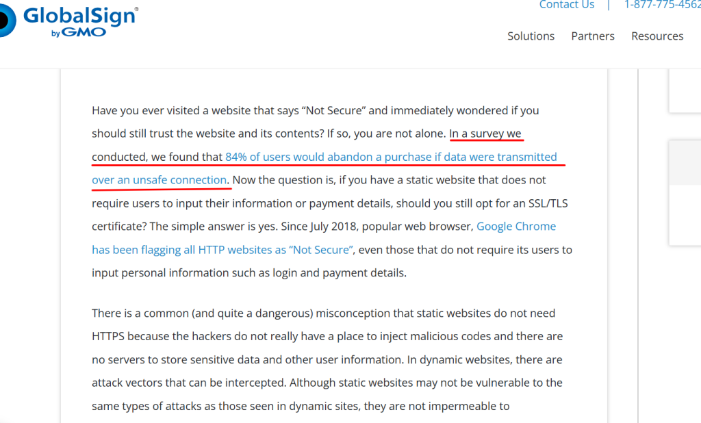
The presence of HTTPS (the “S” stands for secure) is now standard, but visitors still notice when it’s missing. According to GlobalSign’s Website Security Survey, 84% of users would abandon a purchase if data was sent over an insecure connection.
Beyond that, security badges from recognized providers (like Norton, McAfee, or payment processors like Stripe) provide external validation. Privacy policy links near forms reassure people that you’re handling their data responsibly.
These signals become critical at conversion points: quote request forms, checkout pages, or anywhere someone is sharing sensitive information. Without them, abandonment rates spike because trust collapses at the exact moment it matters most.
Privacy transparency as a competitive advantage
Being upfront about what you do (and don’t do) with visitor data builds trust. A clear, accessible privacy policy isn’t just for legal compliance; it’s a credibility signal. When you’re transparent about data handling, you position yourself as a business that respects customers rather than one that’s hiding fine print.
Client testimonials with verifiable details
Testimonials are powerful, but only when they feel real. Generic praise like “Great service!” or “Highly recommend!” does little to build trust because it could apply to anyone and doesn’t prove anything. Testimonials that include specific outcomes, real names, and verifiable details are far more persuasive.
What makes a testimonial credible versus hollow?
Credible testimonials include:
- The client’s full name and business or location
- A specific outcome or result they achieved
- Context about the problem you solved
- Ideally, a photo or company logo
Compare these two examples:
- Generic: “Freelancers HUB did a great job on our website!”
- Credible: “Freelancers HUB redesigned our outdated site and within three months, we saw a 40% increase in qualified leads. Their team understood our industry and delivered exactly what we needed.” – Sarah Mitchell, Owner, Mitchell Landscaping, Ontario
The second example provides evidence. It’s specific, verifiable, and demonstrates real value. That’s what builds trust.
Video testimonials as the next level
If you can capture video testimonials, even short ones, they carry even more weight. Seeing and hearing a real person describe their experience removes almost all skepticism. Video testimonials are harder to fake, which is exactly why they’re so effective.
Fast load times and smooth performance
Site speed isn’t just a technical metric; it’s a trust signal. A slow-loading website suggests neglect, outdated technology, or a business that doesn’t prioritize user experience. Before a visitor even reads your headline, they’ve already formed an opinion based on how quickly your site responds.
Why speed signals competence
People associate speed with professionalism. When your site loads instantly, it feels like you have your act together. When it lags, struggles, or times out, the assumption is that your business operates the same way: unreliable, outdated, struggling to keep up.
According to Google’s research on mobile page speed, 53% of mobile site visitors leave a page that takes longer than three seconds to load. Fast sites also improve engagement. Visitors are more likely to explore multiple pages, read your content, and ultimately convert when navigation feels effortless. Slow sites create friction, and friction kills conversions.
Performance as part of your first impression
Your homepage load time is part of your first impression, just like your headline and hero image. If someone has to wait three or four seconds for your page to load, they’re already questioning whether you’re worth their time. In many cases, they’ll leave before they ever see your content.
Tools like Google PageSpeed Insights can help you identify performance issues, but the simplest test is this: does your site feel fast when you use it on your phone? If not, your visitors are noticing the same thing.
Consistent branding and design coherence
Inconsistent fonts, mismatched colors, or design elements that feel stitched together from different templates all erode trust. Consistent branding communicates that you’re a cohesive, professional operation, not a business that’s winging it.
Why visual consistency matters for credibility
When every page of your site looks like it belongs to the same brand, visitors feel confident. They’re not second-guessing whether they’ve accidentally clicked to a different site or wondering if you outsourced different sections to different designers who never talked to each other.
Consistent design also makes your site easier to navigate, which improves user experience and keeps people engaged longer. When navigation is intuitive and predictable, visitors can focus on your content rather than figuring out how your site works.
Brand coherence beyond the website
Trust is built across touchpoints. When your website design aligns with your social media presence, email communications, and offline materials, you reinforce the perception that you’re an established, professional business. Inconsistency creates doubt.
Social proof and industry recognition
Logos of clients you’ve worked with, industry certifications, awards, or partnerships with recognized brands all serve as external validation. These trust signals tell visitors: “other credible entities have vetted us, so you don’t have to start from scratch.”
What types of social proof work best?
| Type of Social Proof | Why It Works | Best Placement |
| Client Logos | Shows you’ve worked with recognizable or established brands | Homepage, case study pages, testimonial sections |
| Industry Certifications | Demonstrates expertise and adherence to standards | Footer, about page, service pages |
| Awards or Recognition | Third-party validation of quality or innovation | Homepage hero, about page |
| Case Study Results | Provides concrete evidence of your ability to deliver outcomes | Service pages, dedicated case study section |
| Media Mentions | Shows external credibility and authority in your niche | Homepage, press/media section |
Social proof works because it transfers trust. If a business or organization someone already respects has chosen to work with you, that lowers the barrier for new prospects to do the same. According to BrightLocal’s Local Consumer Review Survey, 97% of consumers read online reviews for local businesses, making social proof one of the most influential trust factors.
How to display social proof without bragging
The key is to let the evidence speak for itself. Instead of saying “we’re the best,” show logos and let visitors draw their own conclusions. Instead of claiming expertise, display certifications and results. Confidence comes from evidence, not declarations.
Clear value propositions and transparent messaging
Trust is built on clarity. If visitors can’t quickly understand what you do, who you serve, and why you’re different, they’ll leave, not because they don’t trust you, but because they don’t understand you. Confusion and trust can’t coexist.
How unclear messaging creates doubt
When your homepage is filled with vague corporate speak, industry jargon, or generic claims, visitors have to work to figure out if you’re relevant to them. That extra effort creates friction, and friction leads to exits.
Clear messaging answers these questions within seconds:
- What do you do?
- Who do you help?
- What makes you different?
- What should I do next?
When those answers are obvious, visitors feel confident. When they’re unclear, visitors feel uncertain, and uncertainty kills conversions.
Transparency as a trust multiplier
Being upfront about your process, pricing ranges, or limitations builds trust because it demonstrates honesty. Prospects appreciate knowing what to expect. When you hide details or force people to “contact for pricing,” it can feel like a bait-and-switch setup.
Obviously, not every business can display full pricing publicly, but even a general range or transparent explanation of your pricing model helps. Transparency reduces fear of hidden costs or surprises, which makes prospects more comfortable reaching out.
Up-to-date content and active presence
A blog with the last post from 2019, a copyright footer that says “©2018,” or a “News” section with outdated announcements all signal abandonment. If your site looks neglected, prospects assume your business might be too.
Why freshness matters for trust
Regular updates demonstrate that you’re active, engaged, and invested in your online presence. Even small signals like a recent blog post, updated case studies, or current copyright dates reassure visitors that you’re a thriving business, not one that’s coasting or struggling.
This doesn’t mean you need to publish daily. But having some evidence of recent activity (within the past few months) makes a significant difference in perceived credibility.
Content updates as proof of expertise
Publishing relevant, helpful content also reinforces your expertise. When visitors see that you regularly share insights, answer questions, or discuss industry trends, it positions you as a knowledgeable resource, not just another vendor.
If content creation feels overwhelming, even quarterly blog posts or updated case studies can maintain the perception of an active, engaged business.
Accessible navigation and user-friendly structure
A confusing or cluttered website makes visitors work too hard. When navigation is unclear, visitors assume the rest of the experience with your business will be just as frustrating. Simple, intuitive navigation builds trust by showing respect for the visitor’s time.
What accessible navigation looks like
Good navigation is predictable and minimal. Visitors should be able to find what they need without guessing or clicking through multiple layers. Key pages (services, about, contact, case studies) should be immediately accessible from the main menu.
Avoid overwhelming visitors with too many options. When a navigation menu has ten or fifteen links, decision fatigue sets in. Stick to the essentials and use clear, descriptive labels.
Mobile navigation as a trust signal
According to Statista’s global web traffic data, more than 58% of global website traffic comes from mobile devices. A site that’s difficult to navigate on mobile creates immediate frustration. Mobile-friendly design isn’t optional anymore; it’s a baseline expectation. If your site isn’t easy to use on a phone, you’re actively damaging trust with a huge portion of your audience.
FAQs
Start with what you have. Use high-quality smartphone photos with consistent lighting and composition. Clean, authentic images of your actual workspace or team will always outperform generic stock photos. As you grow, invest in professional photography, but don’t let perfect be the enemy of good.
Quality over quantity. Three to five strong, detailed testimonials with verifiable information will always be more persuasive than twenty generic quotes. Rotate testimonials on different pages to keep them relevant to the content, and update them periodically to maintain freshness.
Yes. HTTPS is now a standard expectation, and browsers actively warn users about non-secure sites. Even if you’re not processing payments, you’re likely collecting contact information through forms, and visitors expect that data to be transmitted securely. An SSL certificate is inexpensive and essential for credibility.
Ask directly. Most satisfied clients are willing to help, especially if you make it easy. Offer to conduct a short interview over Zoom, provide simple talking points, and keep it brief (60-90 seconds is ideal). You can also incentivize participation by offering a small discount or featuring them prominently in a case study.
If you’re aggregating third-party reviews (like Google or Trustpilot), displaying the full range actually builds trust because it shows authenticity. Perfect 5-star ratings can feel suspicious. However, if you’re curating testimonials directly on your site, focus on positive feedback with constructive context. Transparency builds trust, but your website is still a marketing tool.
Ready to build a website that earns trust automatically?
Trust isn’t something you can claim or assert; it’s something you earn through consistent, credible design choices that reassure visitors at every step. When your website demonstrates professionalism, transparency, and competence through the features we’ve outlined here, conversions improve because you’re removing the internal hesitation that stops people from reaching out.
At Freelancers HUB, we specialize in building websites that don’t just look good; they convert. Every site we design is built around trust signals, clear messaging, and user experience that guides visitors toward action without friction.If your current website isn’t generating the leads or credibility your business deserves, book a consultation with our team. We’ll audit your site, identify trust gaps, and show you exactly how strategic design improvements can transform skeptical visitors into confident clients.
