

A dental clinic website is no longer just a digital brochure. In 2026, patients expect it to do the same basic job a good front desk does: answer questions quickly, reduce uncertainty, make booking easy, and help them feel confident before they ever call. If the site feels confusing, slow, outdated, or incomplete, many visitors will quietly move on and look elsewhere.
That shift matters because dental decisions are often tied to hesitation. People may already feel nervous about pain, cost, timing, insurance, or whether they are choosing the right provider. A strong website reduces that friction. A weak one adds to it. That is why dental web design in 2026 is less about visual polish alone and more about clarity, reassurance, convenience, and trust.
Key takeaways
- Patients expect dental websites to answer practical questions fast, especially around services, booking, insurance, location, and first-visit expectations.
- Speed and mobile usability are no longer optional because hesitation grows quickly when pages feel clunky or unstable.
- Online booking, clear navigation, and educational content matter more in healthcare than in many other industries.
- Accessibility is part of modern trust, not an extra feature.
- The best dental websites in 2026 feel calm, fast, transparent, and easy to act on.
Patients expect instant orientation
One of the biggest mistakes dental websites still make is forcing visitors to work too hard to understand where they are and what to do next. A patient should not have to hunt for whether the clinic handles implants, family dentistry, emergency visits, cosmetic treatment, sedation, or new patient appointments.
When someone lands on the homepage or a service page, they want immediate orientation. They want to know what the clinic offers, who it helps, where it is located, and how to take the next step. This does not require a flashy homepage. It requires a clear headline, focused navigation, readable service summaries, and visible next actions.
That is especially important in dental care because many visitors are not browsing casually. They are comparing options, looking for reassurance, or trying to solve a time-sensitive problem. Confusion slows them down. Clarity keeps them moving.
They expect mobile to feel effortless
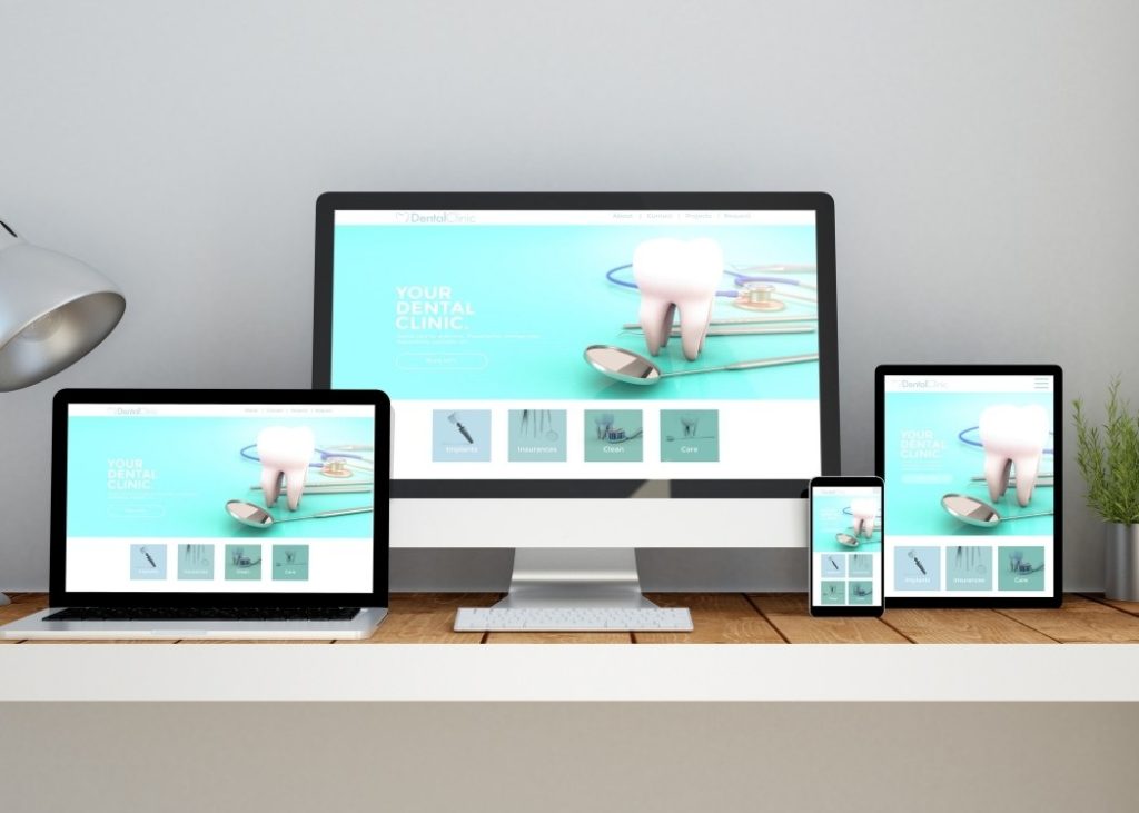
By now, patients assume a clinic website will work well on a phone. That sounds obvious, but many dental sites still behave like desktop-first brochures squeezed into a smaller screen. Menus become awkward, buttons sit too close together, forms are frustrating, and key details disappear below oversized banners.
A patient visiting a clinic site on mobile should be able to call, book, get directions, read reviews, and scan treatment information without pinching, zooming, or second-guessing what to tap.
In practical terms, mobile expectations in 2026 mean larger tap targets, shorter forms, readable text, sticky call-or-book buttons where appropriate, and layouts that prioritize function over decoration. Dental websites that still treat mobile as a secondary version of the “real” site feel behind immediately.
They expect speed because speed signals trust
People do not usually describe a slow website in technical language. They just say it felt annoying, unreliable, or off. But the reaction is real. If pages lag, patients notice. If forms stall, confidence drops. If booking tools hesitate, people start to wonder what the actual clinic experience will feel like.
For dental clinics, that trust issue matters even more. Patients are not just deciding whether to click a product page. They are deciding whether to trust a provider with their health, comfort, time, and money. A fast website feels organized. A laggy one feels careless.
This is why performance expectations in 2026 go beyond loading the homepage. Booking tools, service pages, insurance pages, maps, and contact forms all need to feel stable and responsive. If the site hesitates at the exact moment someone wants to schedule, the clinic loses more than a click. It loses confidence. We have covered about websites and how website speed affect conversion rates, so if you are interested, click here: How Website Speed and Performance Affect Conversion Rates.
They expect online booking without friction
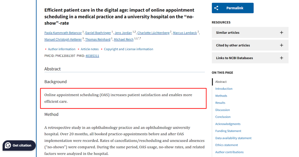
One of the clearest patient expectations now is convenience. If a clinic allows online scheduling, rescheduling, or appointment requests, that system needs to be simple enough that it does not create new frustration. Research on online appointment scheduling and patient satisfaction points in the same direction: convenience improves patient experience when the system is easy to use.
That does not mean every dental clinic needs a complex portal on day one. It does mean visitors expect an easy path to action. A clear booking button, simple availability request form, click-to-call option, and visible office hours already go a long way. The goal is to reduce the gap between “I’m interested” and “I’ve booked.”
This is one area where patient expectations have matured. In earlier years, a contact form may have felt acceptable as the main conversion tool. In 2026, people want something closer to scheduling convenience, not just a message form hidden at the bottom of the page.
They expect transparency before they contact you
Patients do not like uncertainty, especially in dental care. Before they call, many want answers to the questions they may not feel comfortable asking right away. Do you accept new patients? Do you offer sedation? What happens during a first visit? Do you treat children? Do you handle emergencies? What payment or insurance information should I know before booking?
That is why strong dental websites now function partly as reassurance tools. Educational resources, FAQs, service pages written in plain language, and clear first-visit information all help reduce hesitation. Content that addresses real fears and concerns tends to perform especially well, which is why content like this How to Create a Dental Blog That Answers Common Patient Fears, feels so relevant to dental brands trying to build trust online.
Transparency also applies to the clinic itself. Patients expect to see real dentist bios, credentials, office photos, and a clear sense of who they are trusting. A generic website with vague language and stock-style presentation feels much weaker than one that shows actual people and specific care information.
They expect a calm, credible visual experience
A dental website does not need to feel flashy to feel modern. In fact, many of the strongest clinic sites are visually restrained. Patients tend to respond better to layouts that feel calm, clean, readable, and confident, rather than to those overloaded with motion, clutter, or too many competing calls to action.
This is where design choices matter psychologically. Too much noise increases tension. Too little structure creates uncertainty. Good visual hierarchy guides the eye from reassurance to information to action. That may include a clean hero section, a short trust-building introduction, service highlights, review signals, and clear pathways to booking.
The best design work in this category does not scream for attention. It quietly removes doubt.
They expect accessibility, whether they say it or not
Accessibility is no longer a side concern for public-facing service businesses. The W3C Web Content Accessibility Guidelines remain the core reference point for making websites easier to use for people with disabilities. In practical terms, that means readable contrast, usable keyboard navigation, properly structured headings, clear form labels, descriptive alt text, and layouts that do not depend on precision clicks or guesswork.
For a dental clinic, accessibility is not just about compliance language. It is part of patient respect. An accessible healthcare site feels easier for everyone to use, including older visitors, people under stress, users on phones in poor lighting, and anyone trying to complete a task quickly.
In 2026, patients may never explicitly say they chose a clinic because its site complied with accessibility standards. But they do notice when a site feels effortless instead of difficult.
What this looks like in practice
| Patient expectation | What it means on the website | Why it matters |
| Fast answers | Clear services, insurance info, hours, and location | Reduces uncertainty before contact |
| Mobile ease | Phone-friendly layout, large buttons, short forms | Matches how many patients browse |
| Easy booking | Visible scheduling path and click-to-call options | Converts interest into action |
| Trust signals | Real team bios, reviews, office photos, credentials | Builds confidence before a visit |
| Accessibility | Readable, structured, inclusive design | Makes the site easier for more people to use |
What dental clinics often get wrong
Many clinic websites still focus too heavily on what the business wants to say instead of what the patient needs to know. They lead with broad claims, hide practical details, bury booking, or overload pages with too much design noise. Others have the opposite problem: the site is technically functional but emotionally flat, giving patients no real reason to trust the clinic behind it.
That gap is where better web design matters. A dental clinic website should not feel like a template with services pasted in. It should feel like a patient-ready experience built around real concerns, real questions, and real next steps.
FAQs
A dental clinic website should include clear service pages, easy appointment booking, mobile-friendly design, dentist bios, location and contact details, insurance or payment information, and answers to common patient questions. Patients expect quick access to practical information without having to dig for it.
Many patients check a clinic website from their phone before they call or book. If the mobile experience feels awkward, slow, or cluttered, trust drops quickly. A strong mobile layout makes it easier to call, book, find directions, and read treatment information without frustration.
A slow site can make a clinic feel unreliable before the patient even makes contact. Fast-loading pages help visitors stay engaged, move through service pages more easily, and complete booking actions without second-guessing the clinic’s professionalism.
In most cases, yes. Patients increasingly expect to request or schedule appointments online instead of relying only on phone calls or basic contact forms. Even a simple and clear booking path can make a big difference in turning interest into action.
Trust usually comes from clarity and transparency. Real team photos, dentist credentials, patient-friendly service explanations, reviews, office images, and clear first-visit information all help a clinic feel more credible online.
Accessibility makes the site easier to use for more people, including older adults, users with disabilities, and patients who may already be stressed or in a hurry. A clear, readable, well-structured website improves the experience for everyone, not just a small group of users.
Final thought
In 2026, patients expect dental websites to behave like helpful systems, not passive brochures. They want speed, clarity, mobile ease, booking convenience, accessibility, and enough information to feel comfortable taking the next step. When a clinic website delivers that, it does more than look modern. It lowers anxiety, strengthens trust, and supports conversion in the most human way possible.
That is what a strong dental website design really means now. It is not about adding more visual effects. It is about removing doubt.
If you want a site for your dental clinic that feels modern, credible, and easy for patients to use, the next step is not guessing. It is building around real patient behavior. So, why not talk to us? Click here to schedule a free consultation with us!
